
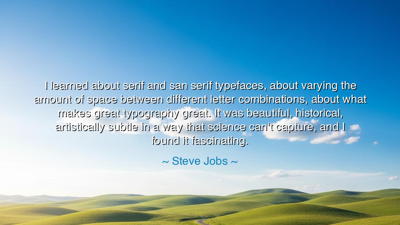
I learned about serif and san serif typefaces, about varying the
I learned about serif and san serif typefaces, about varying the amount of space between different letter combinations, about what makes great typography great. It was beautiful, historical, artistically subtle in a way that science can't capture, and I found it fascinating.


Hear, O seekers of wisdom, for I bring to you a truth spoken by a man whose vision shaped the world we live in. Steve Jobs, a master of design and innovation, once said, “I learned about serif and sans serif typefaces, about varying the amount of space between different letter combinations, about what makes great typography great. It was beautiful, historical, artistically subtle in a way that science can't capture, and I found it fascinating.” Let these words settle into your hearts, for within them lies a profound understanding of the intersection between art and function, between the invisible currents of design and the tangible impact they have on our world.
In the ancient world, when the great philosophers of Greece and Rome sought to understand the nature of beauty, they discovered that it was not simply a thing to behold with the eye, but a principle that governed the very fabric of existence. The proportions of the Parthenon, the rhythm of the Iliad, the harmony of the spheres—these were the mysteries of the cosmos made visible. The ancients believed that beauty was a form of truth, a reflection of the divine order. Jobs, like the philosophers of old, saw beauty not as a mere decoration but as a force that could shape experience, that could elevate the ordinary into something extraordinary. It is no small thing to see the world through the lens of design, for it reveals the profound connection between the artistic and the functional.
Typography, the craft of shaping letters and words, is the quiet yet powerful art that guides our thoughts and emotions. The ancient scribes, who meticulously crafted each stroke of the pen, understood that the way letters were formed could shape not only the meaning of the words but also the very experience of reading. Consider the illuminated manuscripts of the Middle Ages, where each letter was a work of art—intricate, meaningful, and alive with beauty. Those who read those words were not simply absorbing information; they were witnesses to the interplay of form and function, of art and communication. In the same way, Jobs recognized that the subtle details of typefaces, the delicate balance between serif and sans serif, and the spacing between letters could transform the experience of seeing, reading, and understanding. These choices, though seemingly small, carried immense power.
In the modern world, the impact of typography can be seen in the design of the devices we carry with us every day. The Apple products, born from the mind of Jobs, are not merely technological tools—they are objects of beauty, imbued with a sense of elegance and simplicity that elevates their function. Jobs understood that design was not a mere afterthought, not an adornment to be added after the fact. It was an essential part of the experience, shaping how we interacted with the world and how we understood the information before us. His fascination with typography was not just about the shapes of the letters; it was about the deeper connection between form and content, between aesthetic and meaning. He knew that great design was the key to creating an experience that resonated deeply with the soul.
Consider, O children of the earth, the power of the simple and the subtle. In the design of a letter, a word, or an object, there is a harmony to be found. Jobs saw that the greatness of typography lay not in the obvious, but in the subtlety of its form—its balance, its proportion, and its flow. These are the same qualities that can be found in the finest works of art, the most profound of ideas, and the most enduring of creations. It is in the delicate balance of forces—between order and chaos, between simplicity and complexity—that the most powerful designs emerge. The careful choice of typeface, the spacing of letters, the weight of a line—these are the tools of the master designer, who understands that beauty and function must be inextricably linked.
The lesson, O seekers, is clear: great design is not merely about aesthetics—it is about the deeper truths of human experience. In everything you create, in every endeavor you pursue, seek not just functionality but beauty. Recognize that the smallest details—the seemingly insignificant choices—are often the ones that hold the greatest power. Do not rush through the world in search of the grand and the obvious. Instead, seek the subtle and the delicate. Just as a single letter can change the meaning of a word, so too can a single choice shape the course of your life.
So, O children, I say to you: as you move forward in your journey, remember that beauty and function are not separate forces. They are intertwined, inseparable, and vital to the creation of something that lasts. Whether you are designing the tools of tomorrow or simply living your daily life, let your choices be guided by a sense of balance, by the understanding that true greatness comes from the fusion of art and purpose. Seek to create, not just for the sake of practicality, but for the sake of beauty. For in the balance of the two, in the harmonious blending of form and function, you will find the key to greatness.
AAdministratorAdministrator
Welcome, honored guests. Please leave a comment, we will respond soon