

Some people hate lime-green; red has all this emotional baggage.
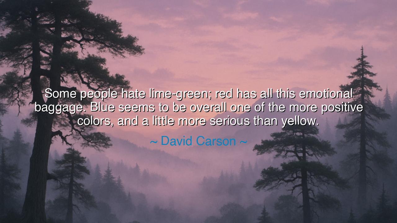
Some people hate lime-green; red has all this emotional baggage. Blue seems to be overall one of the more positive colors, and a little more serious than yellow.


When David Carson declared, “Some people hate lime-green; red has all this emotional baggage. Blue seems to be overall one of the more positive colors, and a little more serious than yellow,” he was not merely speaking of colors, but of the hidden language of perception. His words remind us that hues are not lifeless shades on a palette, but vessels of meaning, each carrying with it centuries of symbolism, emotion, and memory. To understand color is to understand the soul of humanity, for in every tone we find echoes of our deepest fears, our greatest loves, and our enduring hopes.
The ancients themselves revered the power of color. The Egyptians painted their tombs with blue to symbolize the eternal sky and the waters of life. Warriors of Rome donned crimson banners of red to invoke strength and inspire fear in their enemies. The Chinese emperors cloaked themselves in yellow, a color of divinity and authority. Each hue was more than decoration — it was a force, a presence, a story in itself. Carson’s insight flows from this timeless truth: colors are alive with human experience, carrying baggage both sacred and burdensome.
Consider the story of red, a color that carries both triumph and tragedy. It is the hue of roses given in love, but also of blood spilled in violence. It stirs passion, yet also danger. This is why Carson calls it “emotional baggage”: it carries the dual weight of beauty and destruction. In contrast, blue has long been regarded as calming, steady, and trustworthy. From the Virgin Mary’s robes in medieval art to the vast sky overhead, blue whispers serenity and order. It is a positive color, one that gives peace without demanding fear.
Yet Carson does not stop at positivity — he reminds us that colors differ in gravity. Yellow is joyous, radiant like the sun, yet it can appear frivolous, fleeting, and lighthearted. Blue, by contrast, is steady, carrying not only joy but seriousness. Think of the sailor gazing upon the endless ocean, or the philosopher staring into the heavens. Blue is not shallow cheer but deep contemplation, and thus it holds a place of balance between levity and solemnity.
This wisdom speaks not only of art but of life itself. Just as we interpret colors through the lens of emotion and culture, so too do people carry with them shades of experience. One man may radiate warmth like yellow, another burn with passion like red, another bring calm like blue. To recognize this is to understand that life is a spectrum, and that our interactions with others, like our perceptions of color, are shaped by layers of meaning both ancient and personal.
The lesson is clear: be mindful of the energies you bring into the world, for they are like colors upon the canvas of human interaction. If blue is seen as balance, calm, and positivity, strive to embody these qualities. Avoid the uncontrolled fire of red’s baggage, and temper the fleeting lightness of yellow with the depth of reflection. Like the master painter, choose your hues with care, for they shape not only how others perceive you, but how your own soul finds harmony.
In practice, this means surrounding yourself with both literal and symbolic colors that uplift your spirit. Let your environment carry tones that bring focus and joy, and let your words and actions radiate the same. When faced with conflict, be the blue presence of calm and wisdom. When celebrating, allow the yellow of joy to shine, but let it be grounded. When passion calls, channel red into courage and creativity rather than anger. In this way, your life becomes not chaotic splashes but a deliberate painting of meaning.
Therefore, let us carry Carson’s wisdom: colors are not neutral, and neither are the energies we give and receive. Blue, positive and serious, is a guide for balance in a world of extremes. Choose your colors in art, in spirit, and in action with care, and you will not only create beauty for yourself but also for all who dwell within the canvas of your life.
APHoang Anh Phan
This perspective prompts me to think about the subtle ways color affects mood and messaging. How do professionals test whether a color resonates positively with their target audience? Can minor shifts in hue, brightness, or combination with other colors dramatically change perception? I’d like to explore practical approaches to choosing colors that maximize positive impact while being mindful of emotional baggage.
Hhnilyuth
I feel intrigued by the idea that colors carry emotional baggage. But it also raises questions: how much does context change perception? For example, red can mean love or danger, blue can feel calming or cold. I’d like perspectives on how designers and communicators use color strategically to elicit the intended emotional response while avoiding unintended negative associations.
TNTu Nguyen
Reading this makes me think about personal preferences versus societal norms. Are these color associations universal, or do they shift depending on trends, media exposure, and cultural symbolism? I’m curious how designers balance personal taste, audience perception, and psychological impact when selecting colors for logos, advertisements, or art projects.
THtrieu thi thuy huong
This makes me curious about the psychology behind colors. If blue is generally seen as positive and serious, could it subconsciously influence behavior or decision-making in work and social environments? I’d like to explore whether certain colors can consistently evoke emotional reactions across cultures, or if these associations are mostly learned and context-dependent.
KTKhanh Tuoc
I find this observation about colors fascinating because it highlights how perception and emotion are linked. I wonder how much personal experience, culture, or context influences whether a color feels positive or carries emotional baggage. Can two people have entirely different emotional responses to the same color, and how do designers account for that when choosing colors for branding or art?